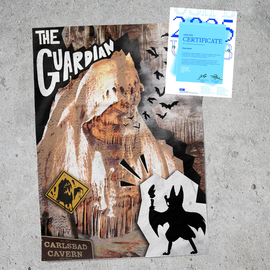
Carlsbad Caverns National Park Poster
Luckymari: VTuber Identity & Assets
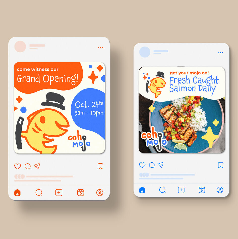
Coho Mojo Brand Identity
ISU Research Identity Work

Business Record Podcast Intro Animations
"Unrecognized Risk" Editorial Illustration
"Eclipse First, The Rest Nowhere"

ISD: Cyclone Basketball Publication Cover
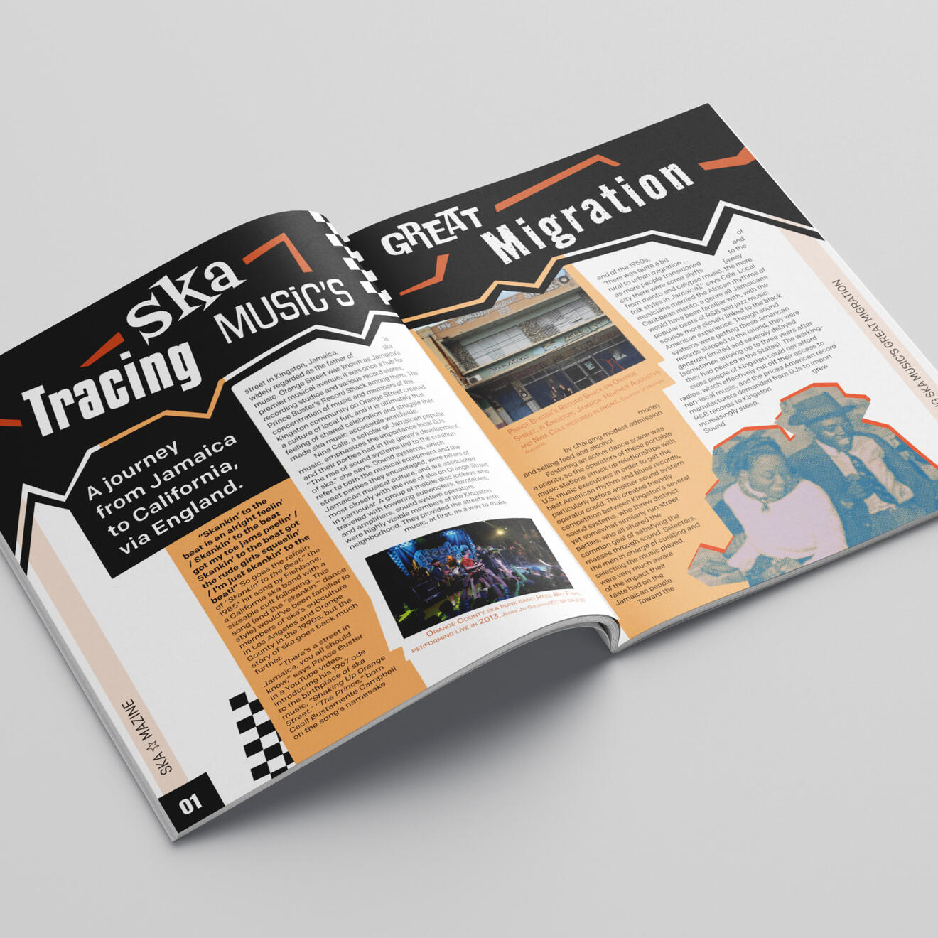
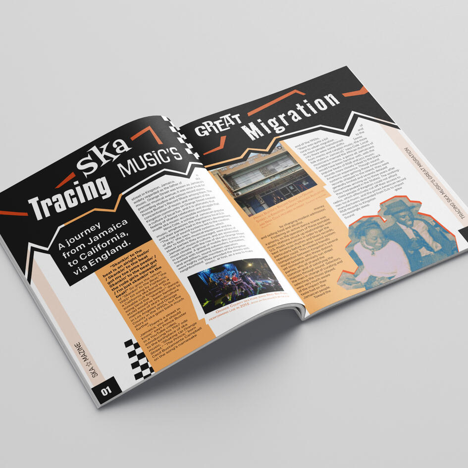
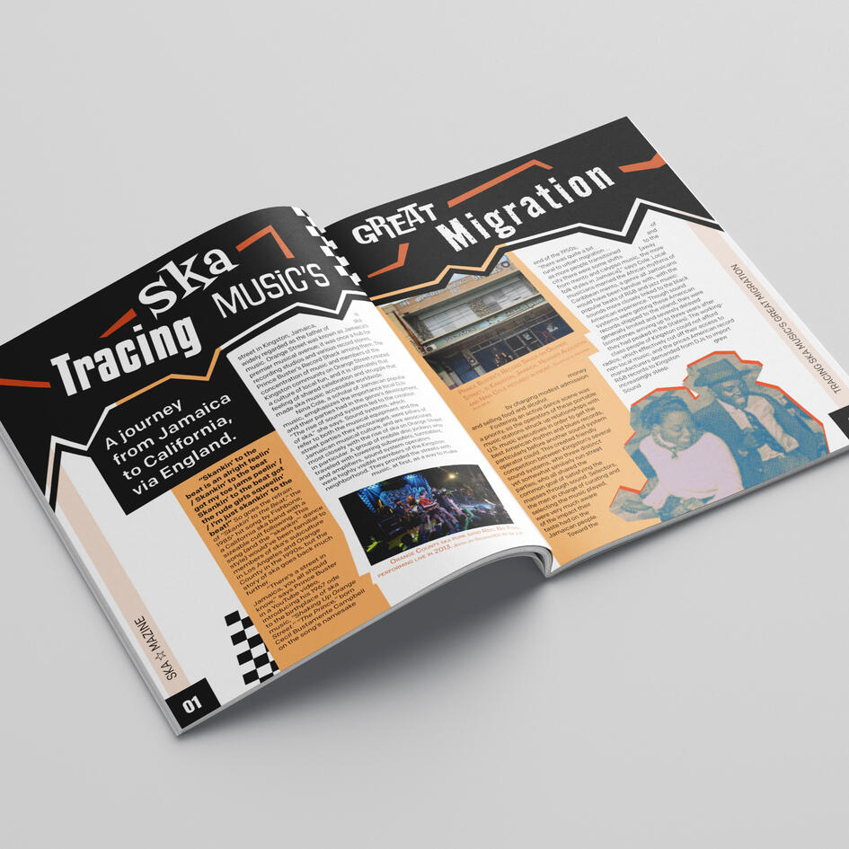
Ska★Mazine: A Ska Magazine

✿ Hello! I'm Ciara (she/her)
I'm a graphic designer and illustrator from Iowa State University, working across brand identity, illustration, and print production. I like projects with a story to tell, whether that’s a brand refresh, an editorial illustration, or a printed zine, and I bring both creative ideas and the attention to detail to see them through.
When I'm not drawing or designing, I enjoy video/board games, listening to music, and learning new things! I also run a small Etsy shop where I sell homemade stickers and such.
✂ Tools


✪ Experience
May 2025 – May 2026
Model Farm Creative Services Agency
Graphic Designer, Part-time & Internship
June 2024 – Present
Freelance Illustration & Print Production
Self-employed
April 2025
Design/Shift — Philanthropic Design-a-thon
Volunteer Graphic Designer
Let's work together!
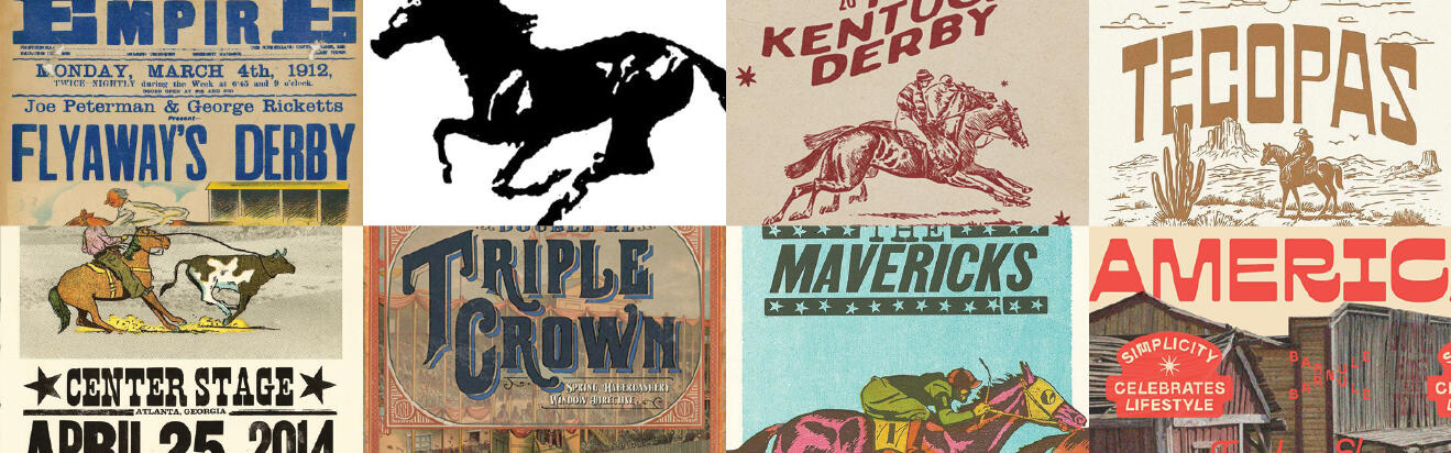
Ska★Mazine: A Ska Magazine
Energetic and punky, I wanted to replicate the feeling of the ska music genre with cut-outs, simple loud colors, and eccentric shapes. I looked to existing ska event posters and band albums for inspiration. The name Ska★Mazine is supposed to be a play on words, combining "ska" and "magazine" while phonetically sounding like "ska " and "amazing". Ska is one of many music genres I appreciate a lot and I wanted to show that through this project.
Front/Back Covers


The back cover features John "Teflon" Sims' iconic "ska guy" image.
Cover Concepts and Layout Sketches


Featured Spreads


Mockups


while you're here...

"Eclipse First,
the rest nowhere"
Luckymari: VTuber
Identity & Assets
ISD: Cyclone Basketball
Publication Cover


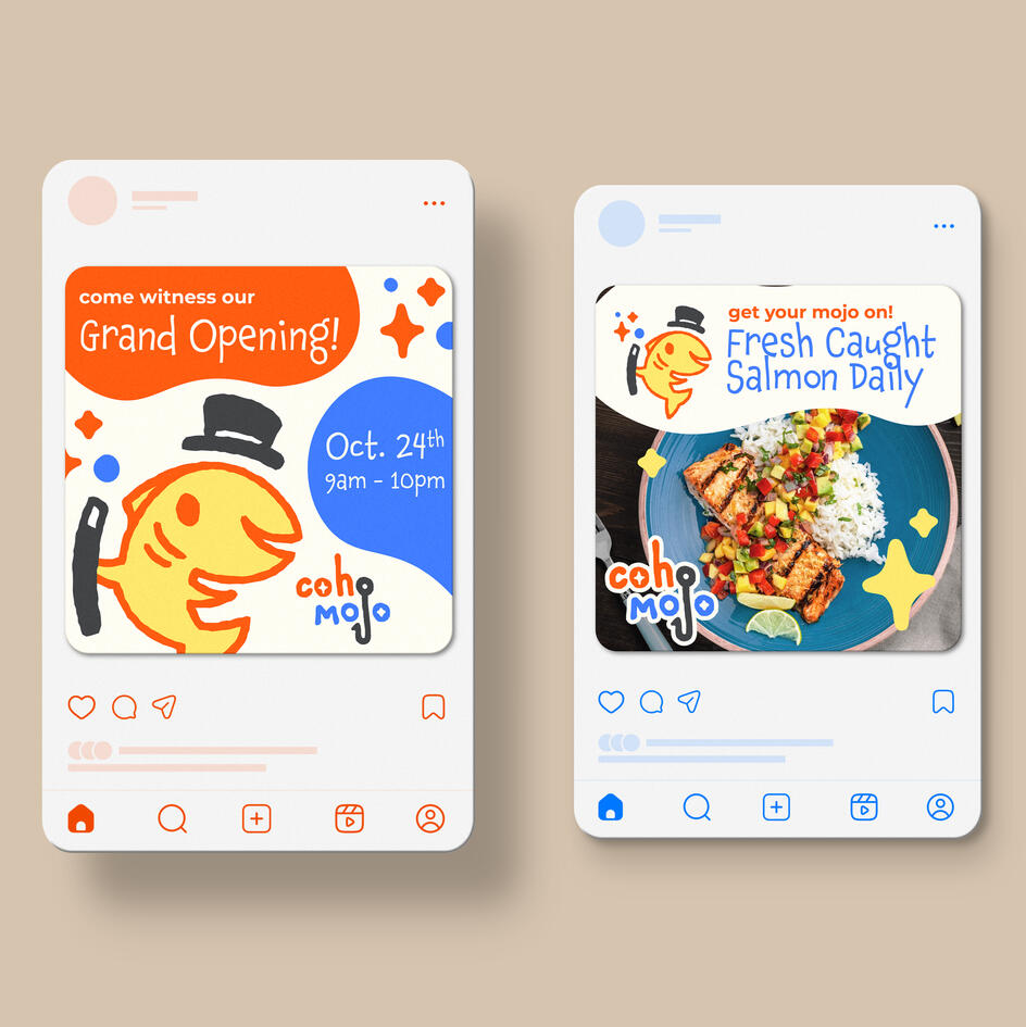
Coho Mojo Brand Identity
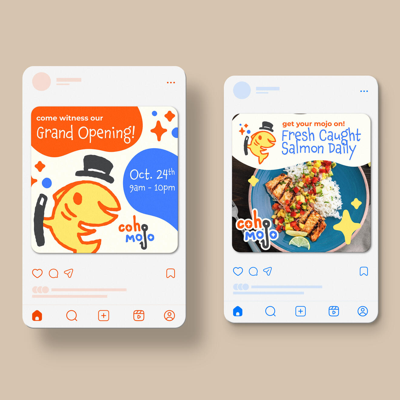
Coho Mojo is a casual, family-friendly seafood restaurant that serves up fresh seaside favorites alongside lively magic show entertainment for all ages. The overall design direction for this project leans into a playful, whimsical aesthetic that appeals to families and children without feeling juvenile — balancing fun and approachability with a fresh, modern feel.
Logo

Brand Guidelines Book


Social Media Posts


Brand Applications


while you're here...

Business Record Podcast
Intro Animations
Ska★Mazine: A Ska Magazine

ISU reserch identity work


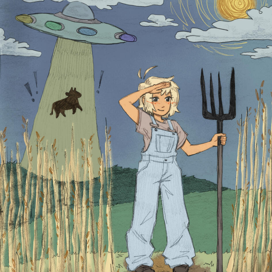
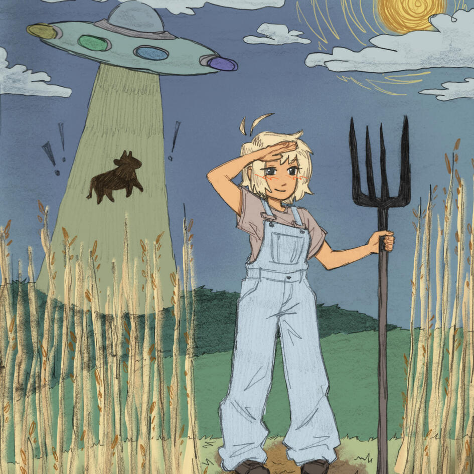
"Unrecognized Risk"
Editorial Illustration
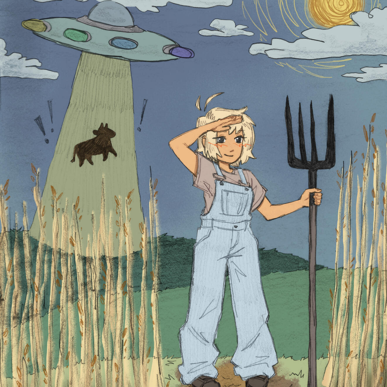
The goal of this illustration was to fulfill the prompt "unrecognized risk", with the additional challenge of drawing traditionally and adding color digitally. My final piece is an illustration of a farmer girl who is too distracted to realize her cattle is being abducted be aliens.
Final Illustration
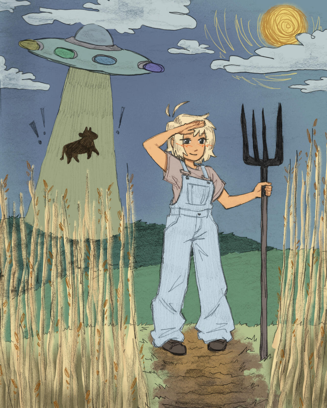
The process began with word-based brainstorming and rough sketches to value sketches. I then refined the chosen value sketch digitally, printed it out, and traced it on paper. From there, I refined it further only using graphite before scanning and adding color in Clip Studio Paint.
Sketches & Process


while you're here...
ISU reserch identity work

Carlsbad Caverns
National Park Poster"Eclipse First,
the rest nowhere"
Business Record Podcast Intro Animations
Business Record is a Des Moines-based business news outlet with a growing podcast network. I created intro animations for two of their shows:
Fearless, a podcast empowering Iowa women in work and life, and the Iowa Economy Podcast, which covers the trends and data shaping Iowa's business landscape. Working from already-established podcast logos, the challenge was bringing each mark to life in a way that matched the tone of two distinct shows.
Watch these on their website!
Final Animations


while you're here...

"Unrecognized Risk"
editorial illustrationISU reserch identity work

Ska★Mazine: A Ska Magazine

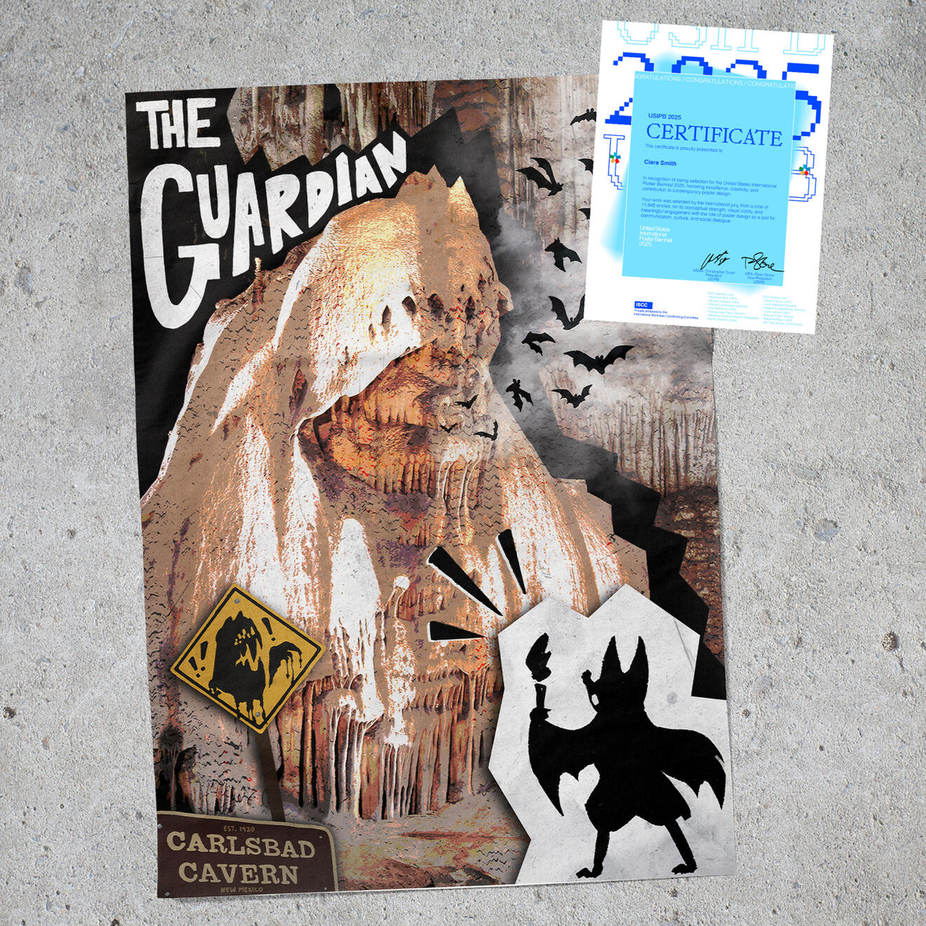
Carlsbad Caverns National Park Poster
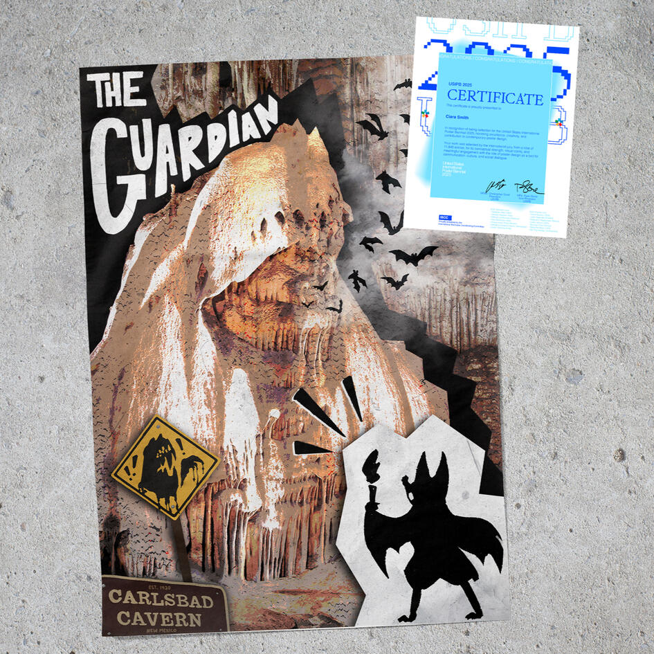
This poster was created to submit to the United States International Poster Biennial (2025) and was selected for worldwide exhibition. The prompt was national parks and my park of choice was Carlsbad Caverns National Park in New Mexico. It's known for it's unique rock formations, this one being named the "Guardian". Their park mascot, Carl S. Bat is included in illustration.
Final Poster
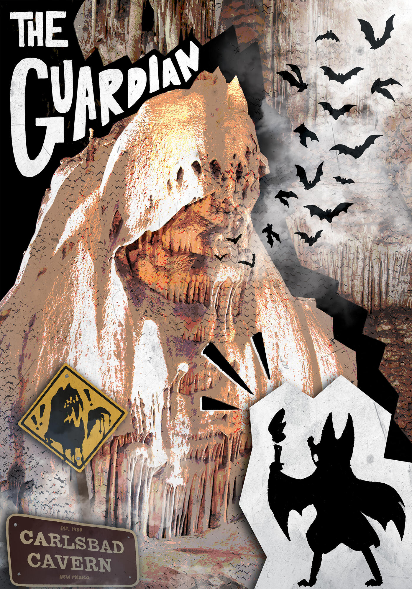
My goal was to convey the awe and wonder of exploring a national park while exhibiting the unique characteristics of Carlsbad Caverns; the vast caverns that lie below the dry desertland and unique rock formations within. During my reserch, the "Guardian" catching my eye in particular for it's sheet size and monstrous appearance, so I decided to tell a story as if it's actually a living creature. Bats are also key to Carlsbad's identity, with 17 total species of bats found within the caverns. This is represented with exactly 17 silhouettes of bats flying out of the Guardian's mouth.
Brand Pages


First concept plays with the idea behind the ice age giant sloth's skeleton that was found deep within the caverns when it was first explored. Researchers have no clue what it was doing so deep in the cave. The giant skeletal sloth hand rips at the imagery between the caverns and park aboveground.
Third concept explores the use of repeated bat silhouettes blended with the park's above and underground natural features.
Mockups


while you're here...
Luckymari: VTuber
Identity & AssetsBusiness Record Podcast
Intro Animations"Eclipse First,
the rest nowhere"


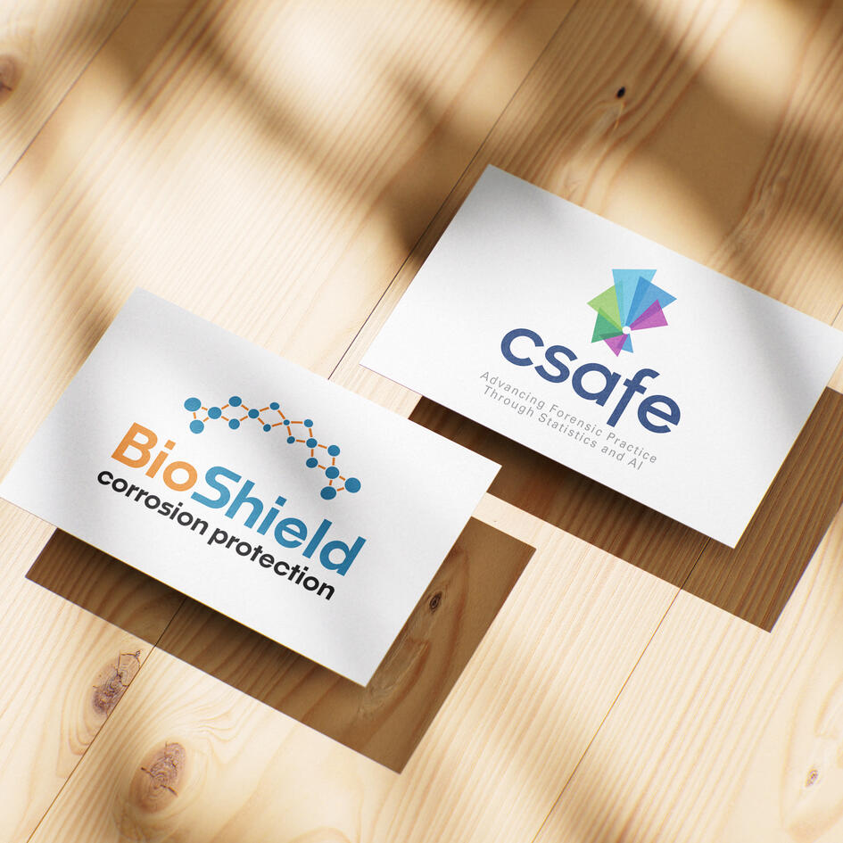
ISU Research Identity Work
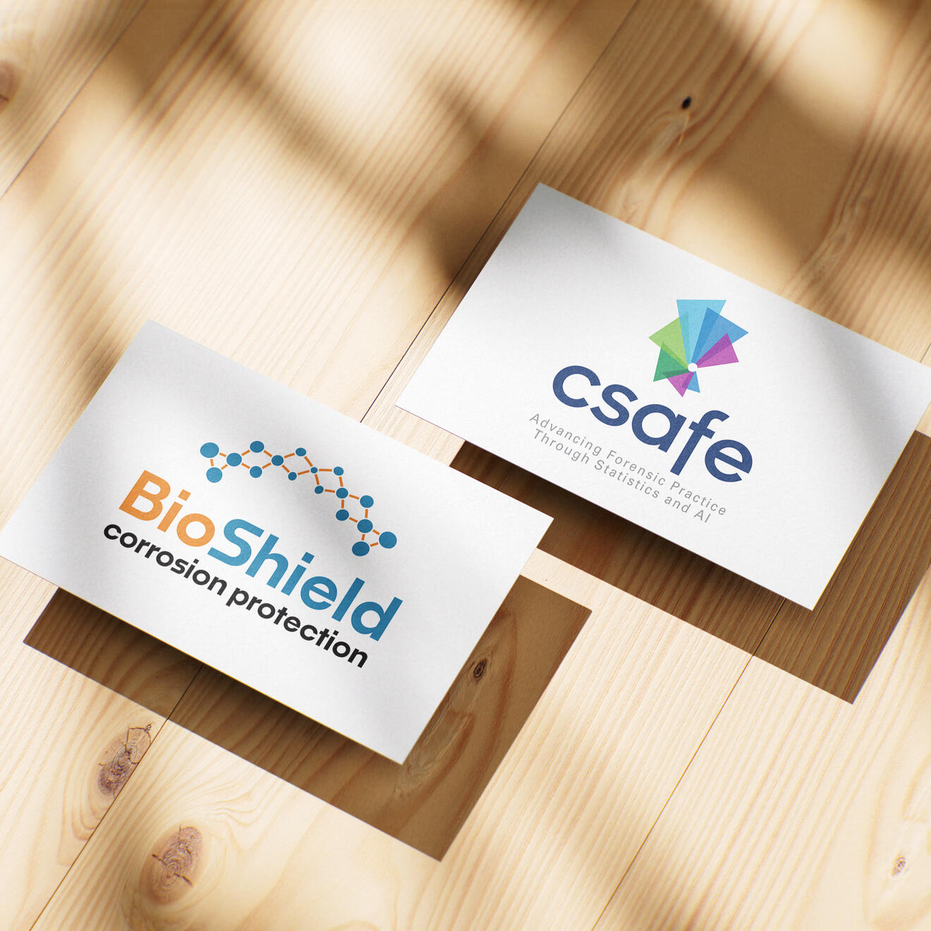
CSAFE is a federally funded forensic science research center that was rebranding to reflect a broader scope in evidence analysis. The goal was a cleaner, more confident mark that felt like a clear step up from their existing identity — modern and refined without losing recognition.
BioShield CP is a federally funded research initiative working on bio-inspired microbial coatings as a greener alternative to chemical corrosion protection. The challenge was taking their research product and shaping it into a visual identity that felt approachable and credible across a wide range of audiences while avoiding any medical cannotations.
Primary Logos


Brand Pages


Page from CSAFE's brand guidelines, showing all acceptable versions of the primary logo that I designed and a single page brand guidelines for BioShield, designed by me.
Logo Concepts


Csafe's concepts were based around representing many pieces as one, to fit their brand refresh of branching out their scope of statistics. Their original palette consisted of nearly 20 colors across the spectrum, so I narrowed it down to blues and greens to represent data, trust and growth.
BioShield's original logomark was a gray and green shield, but they wanted to rebrand with less literal imagery and a new palette. Similarly to Csafe, I worked with the concept of many working as a whole since the coating they're researching consists of a microbial composition. Inspired by the idea of interlinked microbes, I created a couple different concepts. The blue gives a sense of technology and trust while the orange conveys energy and innovation.
while you're here...

Coho Mojo brand identity

ISD: Cyclone Basketball
Publication CoverBusiness Record Podcast
Intro Animations

Luckymari: VTuber
Identity & Assets
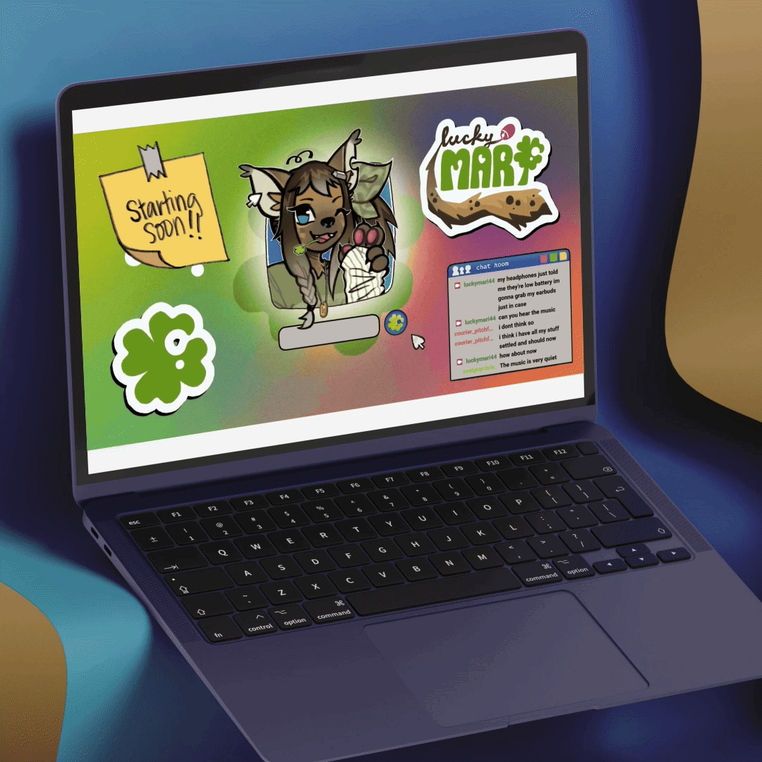
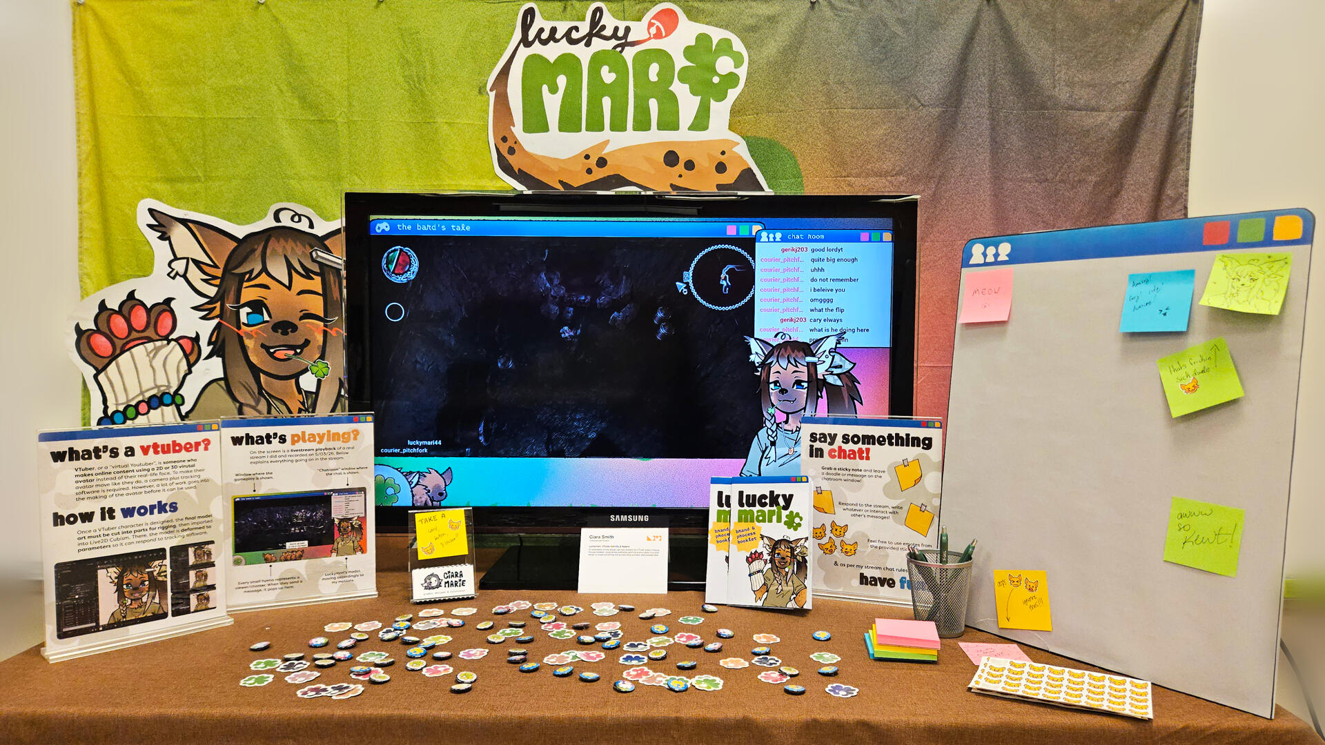
The VTuber space is dominated by polished anime aesthetics, with fully animal-based designs making up only 10% of the market. Luckymari is an original character and complete streaming brand designed to fill that gap — targeting audiences who feel like VTuber content isn't made for them.
The identity balances playful and grounded through a hand-drawn logo, earthy color palette anchored in browns and greens, and rough-edged imagery that avoids the over-polished look common in the space. Deliverables included a full brand system, VTuber model (rigged in Live2D), streaming overlays, emotes, and Twitch channel assets.
This was my capstone project, which was displayed at the ASSEMBLED, ISU's Graphic Design Graduation Exhibition 2026.
Application of Deliverables


Brand/Process Booklet


Exhibition Display Signage


Exhibition Display


while you're here...

"Unrecognized Risk"
editorial illustrationCoho Mojo brand identity
ISD: Cyclone Basketball
Publication Cover


"Eclipse First, The
Rest Nowhere"
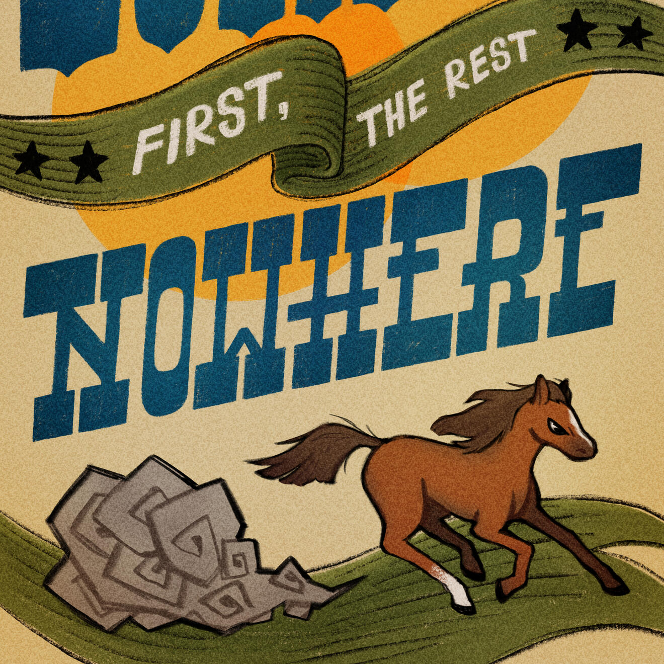
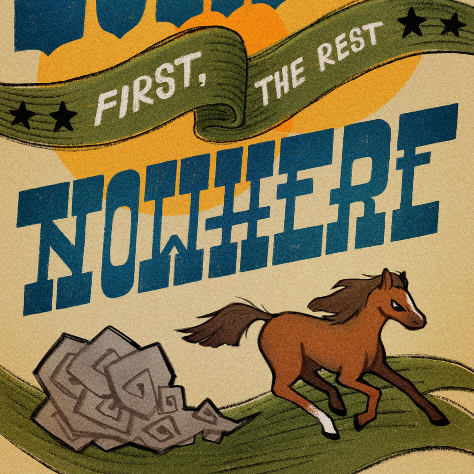
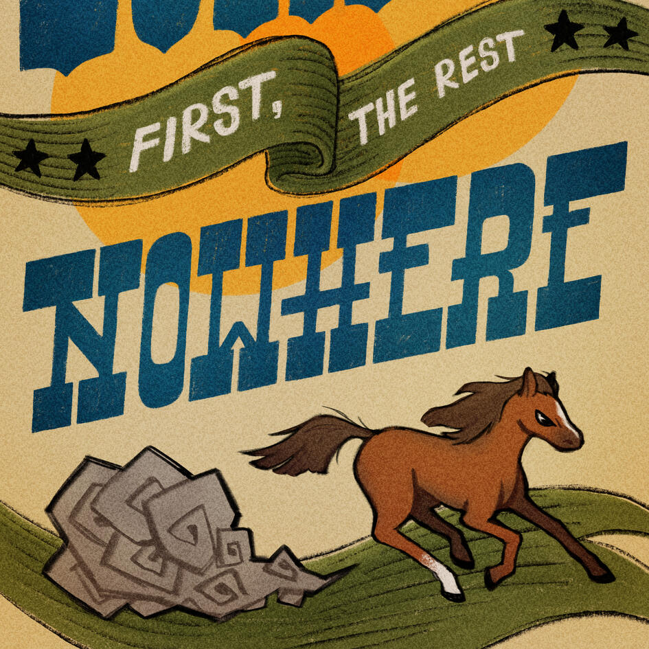
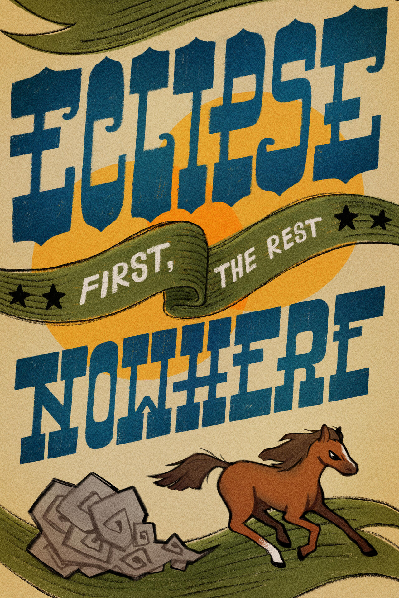
Hand lettered illustrated poster inspired by the famous quote attributed to the legendary race horse, Eclipse. Designed with a vintage western aesthetic, combining decorative lettering with editorial illustration.
"Eclipse first, the rest nowhere" traces back to an 18th century British racehorse so dominant that no competitor could even finish close. His name became a lasting expression for total, uncontested victory.
Final Illustration
Process Stages


Inspired by old horse racing newspaper clippings and flyers, I chose a dramatically thick reverse contrast slab serif to reflect the bold nature of both the quote and an actual solar eclipse. The ribbon references the tradition of awarding winning horses, in green for the racing turf. The slanted orientation of "eclipse" and "nowhere" contrasts the ribbon's soft round shape and gives a strong sense of forward motion.
Moodboard
while you're here...

Carlsbad Caverns
National Park Poster"Unrecognized Risk"
editorial illustrationLuckymari: VTuber
Identity & Assets


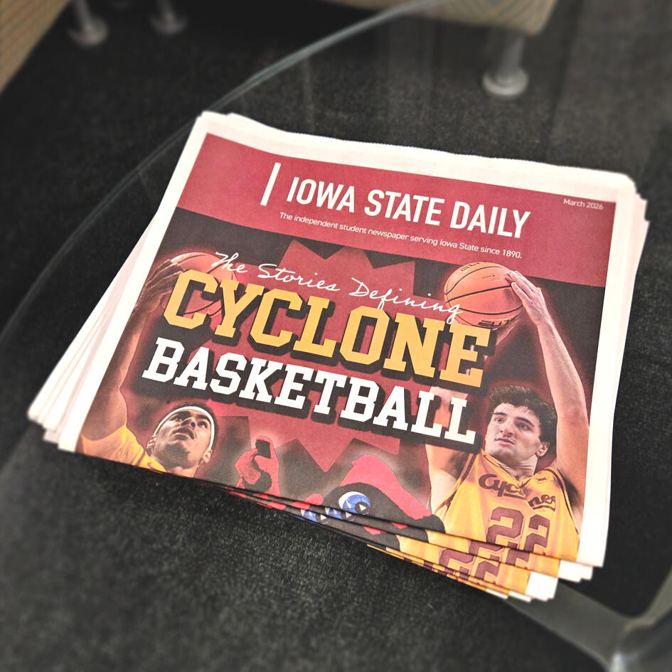
ISD: Cyclone Basketball Publication Cover
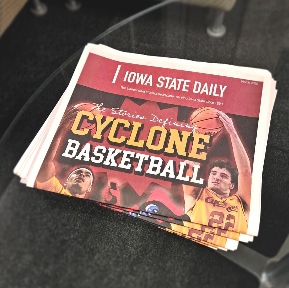
Cover design for the Iowa State Daily's annual Cyclone Basketball publication, featuring a compositional arrangement of some of the star players of the season. I also assisted with layout design and led the reformatting as the publication shifted to a narrower trim size.
Cover
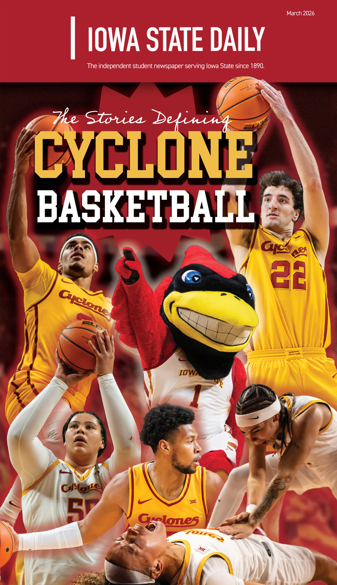
Given a list of featured players, I curated and cut photos from recent games to arrange for the cover. To set this apart from past covers, I chose Cy (ISU's mascot) as the centerpiece, with players surrounding him. Their placement was intentional, alternating gender and jersey color for a balanced but slightly asymmetrical composition.
Internal Pages


while you're here...
Ska★Mazine: A Ska Magazine
Carlsbad Caverns
National Park Poster
Coho Mojo Brand Identity